


In this article I want us to go through a more complex feature of Logtail – processing collected data using an embedded Grafana interface.
Hello again! You may or may not remember how I wrote about the basics of integrating Vercel-deployed Next.js apps with Logtail. If you haven’t read that article, I highly recommend it! You can find it here: “Monitor Next.js API routes using Logtail.”
In this article I want us to go through a more complex feature of Logtail – processing collected data using an embedded Grafana interface. A quick reminder for those of you who are unfamiliar: Logtail is a great log management service that allows you to collect data through integrations with many different platforms. You can check out more on the supported platforms in the docs.
Before you start
In this tutorial, I won’t dig into platform integrations. If you want to learn more about these, feel free to check out part 1. An added benefit is that if you set up your app following that tutorial, you can use it as a data source for today!
Otherwise, if you’d like to follow along, you’ll need a Logtail account, a Vercel-deployed app, and a working integration between these two.
I also recommend having some data already gathered in Logtail, since we’ll be filtering a lot of it in order to create our dashboard. For the purposes of this tutorial, I’ll use data gathered from one of my apps.
Have a project in mind?
Let’s meet - book a free consultation and we’ll get back to you within 24 hrs.
Using SQL within Logtail
First, let’s start with some simple SQL queries to see what data we can access. To do this, click Explore with SQL within the navigation panel in Logtail. You’ll see an interface containing a query editor, as well as a graph and a table for visualizing the outputs. If you’ve ever worked with Grafana before, it will look familiar because that’s what Logtail uses here.
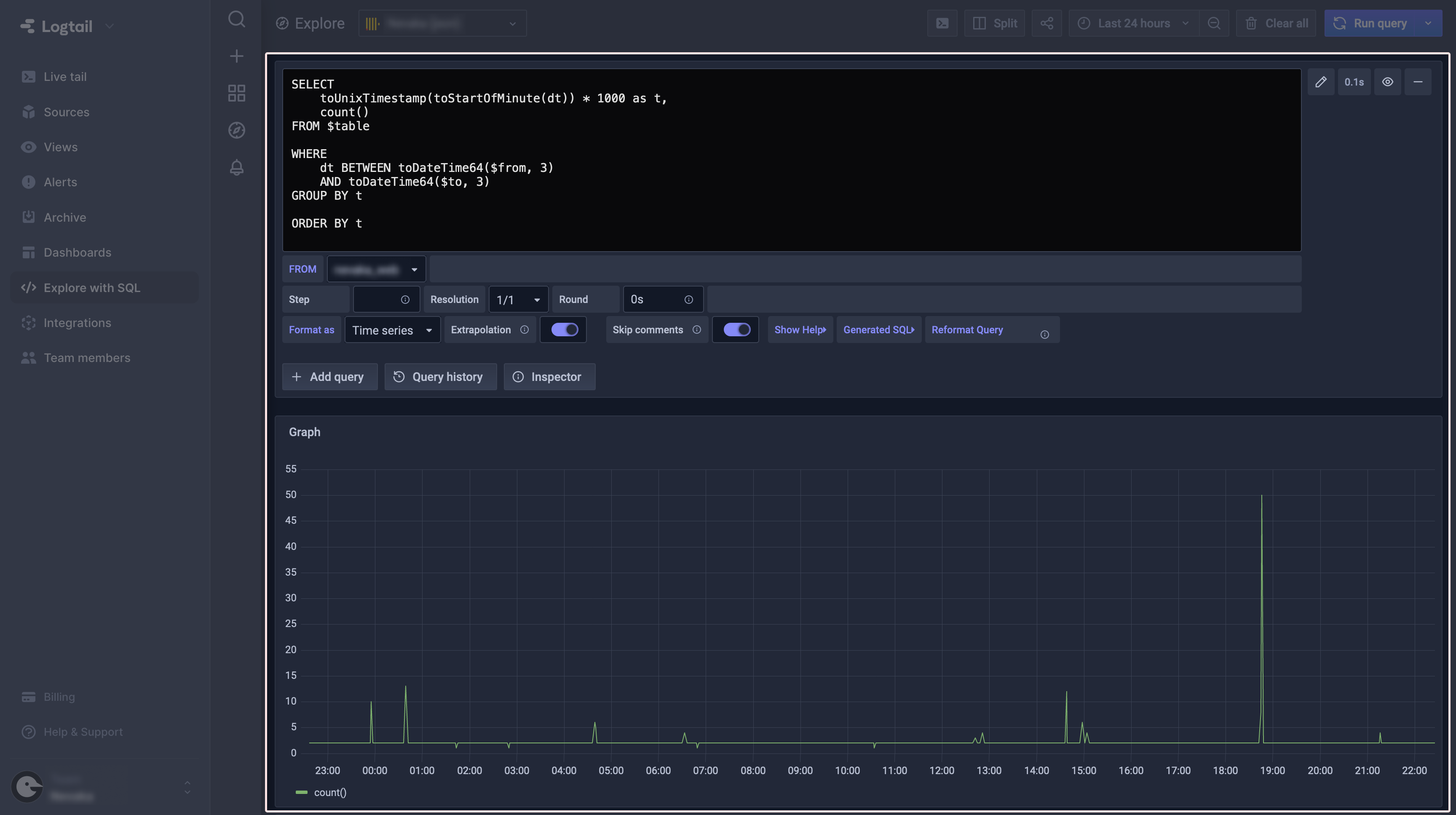
Query editor
By default, a freshly opened Explore page has a query editor with an initial query already in it. All it currently does is count how many data entries were gathered by Logtail during a selected time period. We won’t discuss the basics of SQL here, but there are some things that may not be instantly obvious and need some explanation. So let’s take a look at the default query.
The query takes data from column dt (which stands for Date and Time) and then processes it using two functions: toStartOfMinute and toUnixTimestamp. You may say, “Wait a minute, these aren’t native SQL functions!” And you’ll be right. That’s because Grafana uses a ClickHouse flavor of SQL, which gives us access to tons of helpful utilities that make querying for specific data much easier. ClickHouse has its own docs in which you can find a description of every single one of them.
Back to our query. Next up ahead is count(), and as you may have already guessed, it is another utility from ClickHouse, although it performs almost the same as native SQL COUNT.
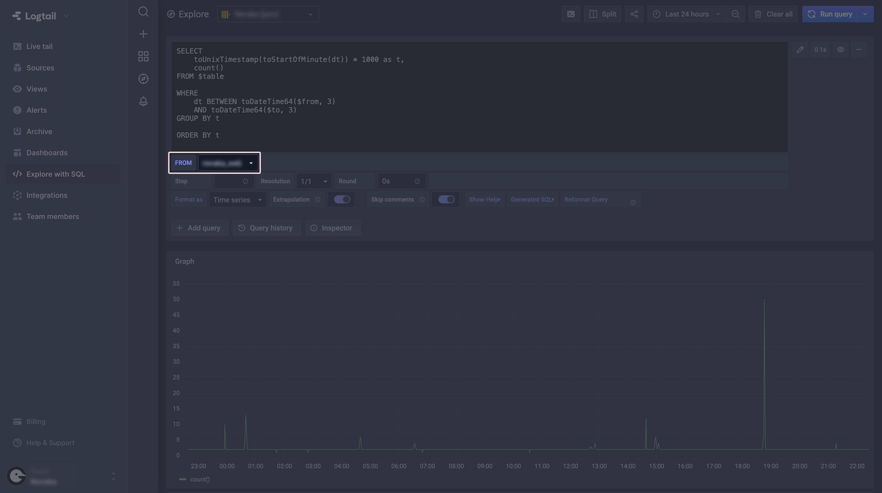
Above are the columns selected from the table, but FROM statement in our query has $table instead of the real name. Below the query editor, there is a selectable FROM field which displays tables from which you can retrieve data. $table is just a macro which links that selector with our query.
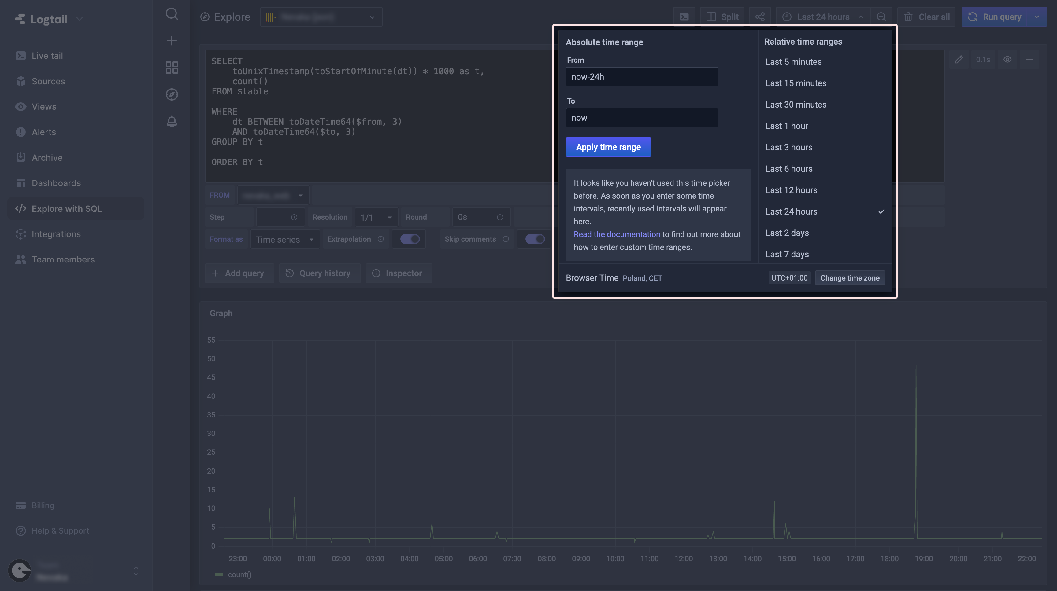
If you’ll take a look at the WHERE clause, we have two more macros there: $from and $to. They work exactly the same as $table, providing a more user-friendly selection of the time period.
And that wraps the default query. Its output can be seen in the next two panels below the query editor: Graph and Table. At this point, all they can do is simply visualize queried data, so you don’t have any control over how they look and behave. This is just how the Explore tab works, as it should be used mainly to build one-off queries.
You may ask, “Well, it’s nice to get the data using SQL with all these utilities but… is that it? No way to save the query or at least the results?” The answer is: of course that’s not it! We’re just getting started. All that introduction to querying data was just so you don’t feel lost when we discuss the next step, which is creating dashboards.
Dashboards
Let’s talk about the main reason why we started tinkering with querying data using SQL. The Explore tab was great for quick simple queries but what if that’s not enough? In that case, select Dashboards on the Logtail navigation panel and you’ll be presented with a sample dashboard for your app:

As you can see, the dashboard consists of a few different blocks displaying data, called panels. Despite being a part of a default dashboard, each of them is fully editable so you can check out how it works under the hood.
In the next steps, we’ll create our own dashboard, which will consist of the following panels:
- API routes calls counter and graph
- API routes errors counter
- Mean API route execution time and graph
- Top 5 most frequently accessed app routes
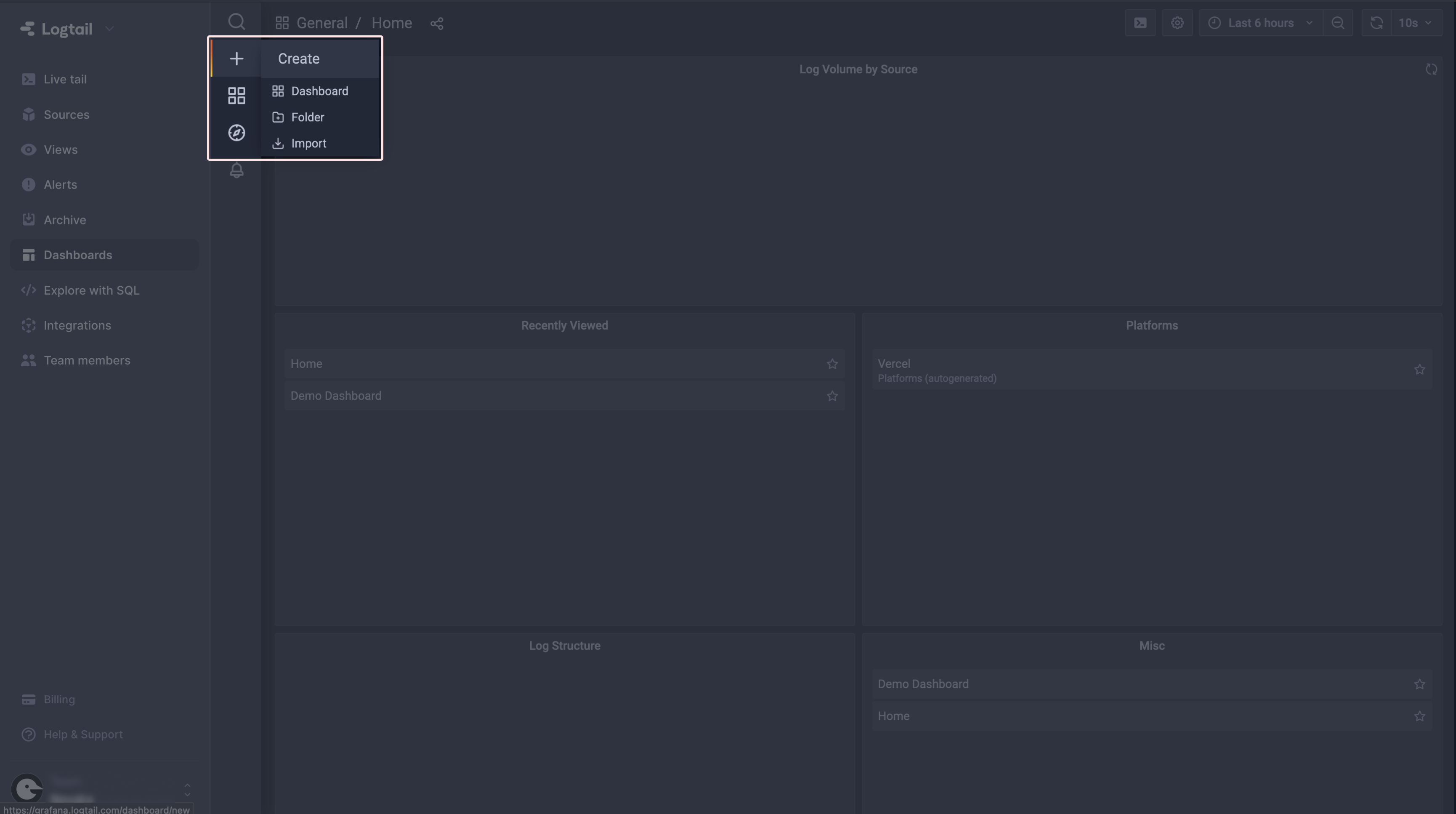
I’ll guide you through the process of creating every single one of them, so let’s begin by creating our own dashboard. To do this, select the + (Create) button, and then click Dashboard:
Creating panels
Since we know what dashboards are for, let’s create some custom panels that will allow us to monitor our app. At the end of this tutorial we will have a complete Grafana dashboard, giving us statistics about the usage and performance of the app.
(1) API calls
The first panel we’ll add to our dashboard will show us the total API routes calls count. In order to create that, select the Add panel option in the top right corner of your dashboard and then Add an empty panel.

You’ll see default query again, but this time in a fully-featured Grafana editor. To create our counter, let’s start by preparing the query. Just to remind you, we want to see how many times our Next.js API routes were called. Since we know that their path always begins with /api, let’s use that to create the query. Try by yourself, and when you are ready, just check against the section below to see what I’ve use here.
⚠️ One important tip: switch the Format as option to Table and select Table visualization, since the default Graph will not show you the results you want to see. You can find the Format as selector below the query editor and visualization on the panel on the right.
At this point I’ll assume that you have your query ready and working. You should have the data formatted like so:
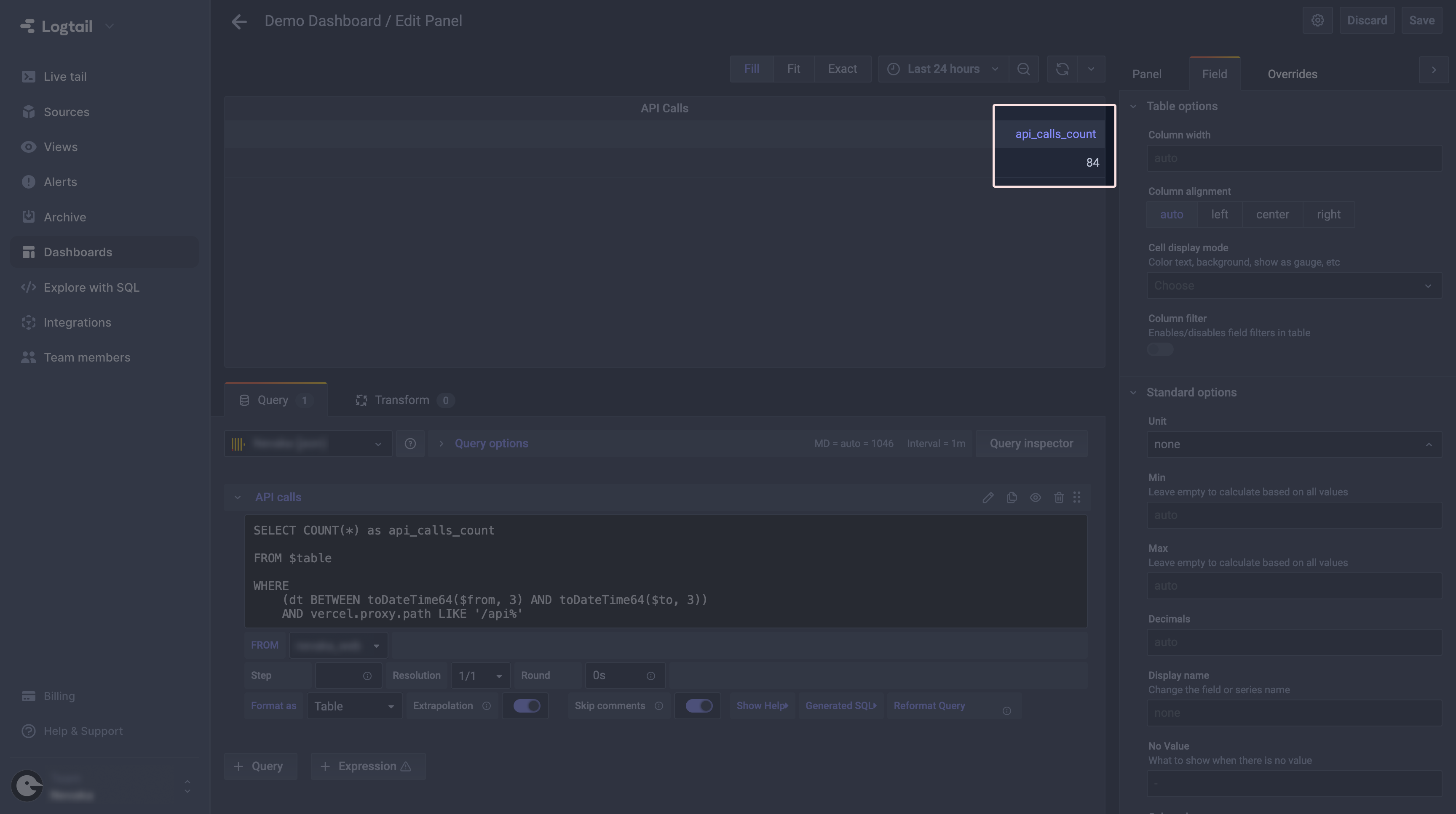
With our count value ready, let’s switch to a more user-friendly style of visualization. From the panel on the right select the Gauge style. That will switch the default table view to a nice gauge chart which is much more readable for that type of value.
You may notice (depending on you current value) that the whole gauge is red and this unnecessarily looks quite alerting. In order to change that, select the Field tab on the panel and head to the Thresholds section. You can reconfigure the default 80 threshold here by changing its value or color (just click on the colored dot), or add another one. I’ll configure mine like that:

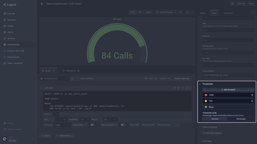
We are almost done. In order to make our panel look and behave even better, you can also show in what units the values are displayed. See that Unit field under the Standard options at the top of your current panel? You can select one of the predefined units or just type in your own.
The last thing you may want to do is to change how the current value is displayed. In order to do that, go back to the Panel tab and look for the Display section. I’ll change the Calculation field from Last (not-null) to Last. Doing so will prevent the dashboard from presenting an old value when something goes wrong with data querying.
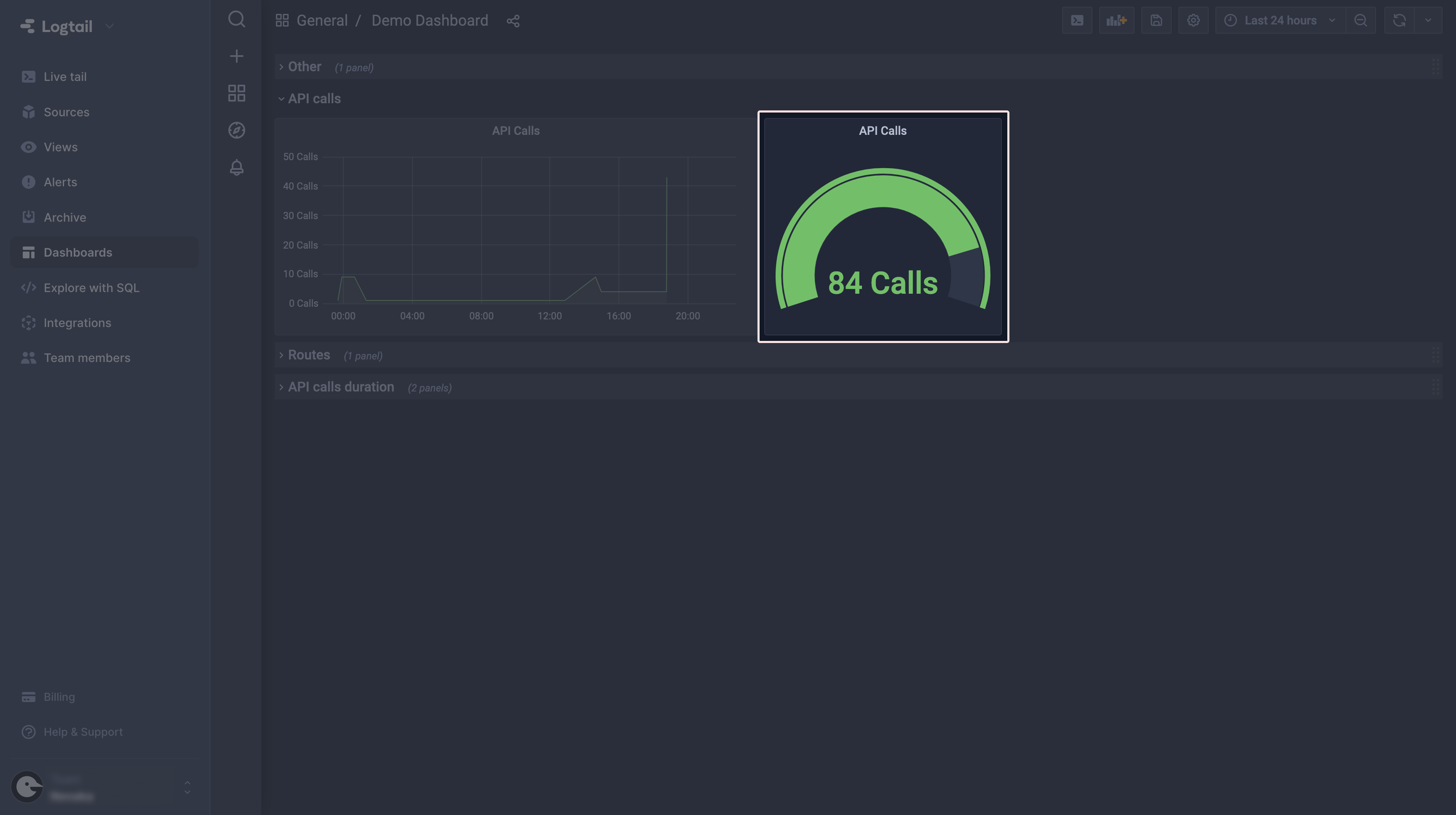
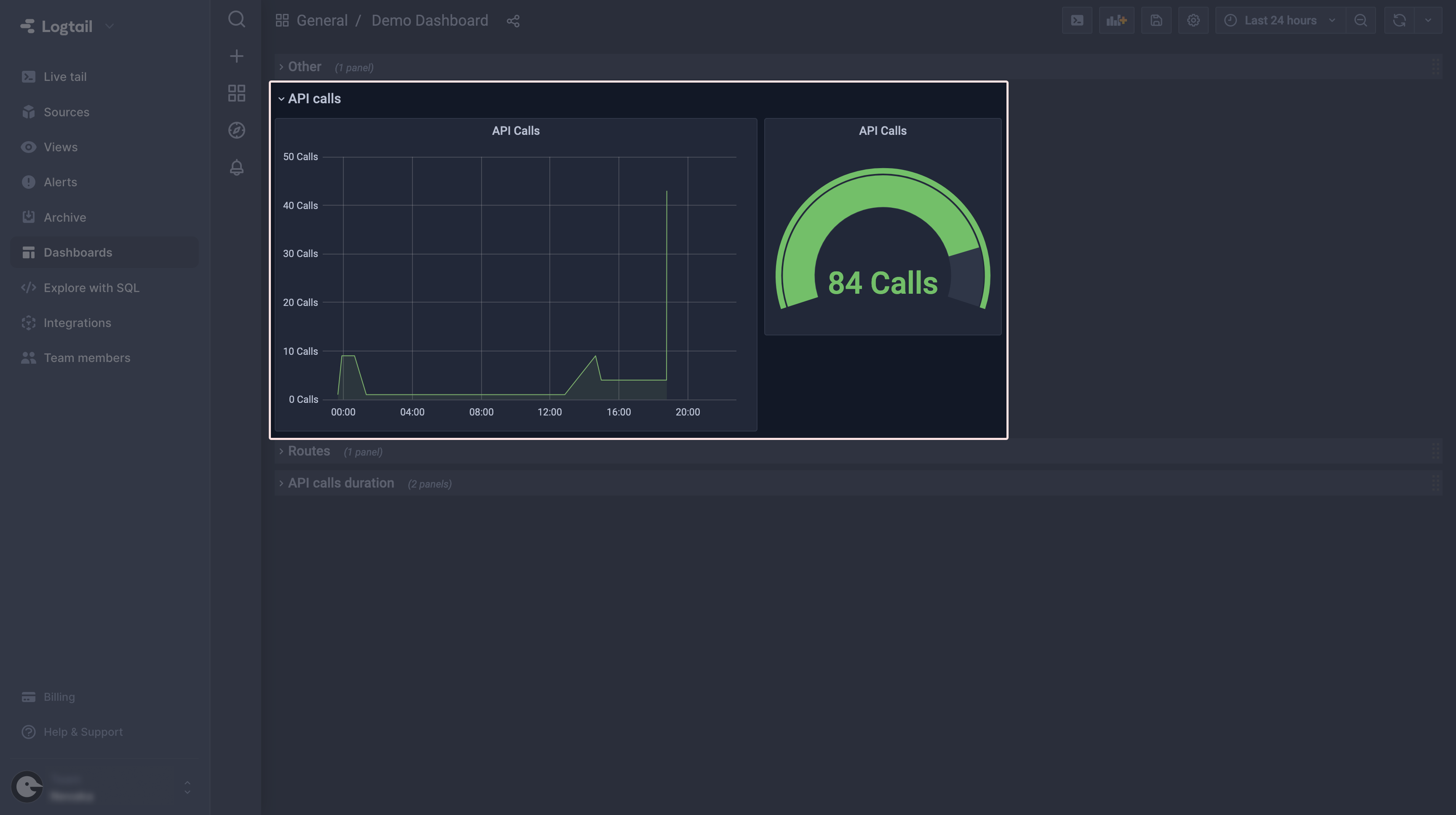
At this point, our API calls panel should look like that:
Last but not least, click Save in the top right corner of your screen to make sure our precious work won’t go away. You may now go back to the dashboard and see our newly created panel there.
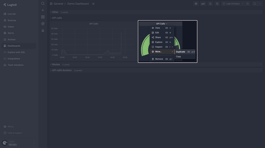
The panel with a gauge chart looks cool, but you may also want to have some insights on how that value changes over time. So let’s create another panel. Since we already have one which contains the query to retrieve the data we are interested in, we’ll just modify what we have. In order to do that, select the Duplicate option and then Edit.
We have to do two things now. The first is to change the visualization style to a Graph, and then modify our query to retrieve the data in a way that can be graphed on the chart. I’ll jump straight to the query, since you already know how to select your visualization style.
As you can see, there are some differences between the gauge query and the one we pulled now. The main difference is the extended SELECT clause, since we need to have a timestamp in order to be able to graph the data. Also, GROUP BY and ORDER BY clauses were added.
One last thing we have to do is to change the Format as option in the query editor to Time series. After doing that, you should see the data graphed and we are done!
You may want to disable the legend, as we have only one series on our chart. You can do that under the Legend section on the panel.
Save your panel and go back to the dashboard – both panels should look like so:
(2) API errors
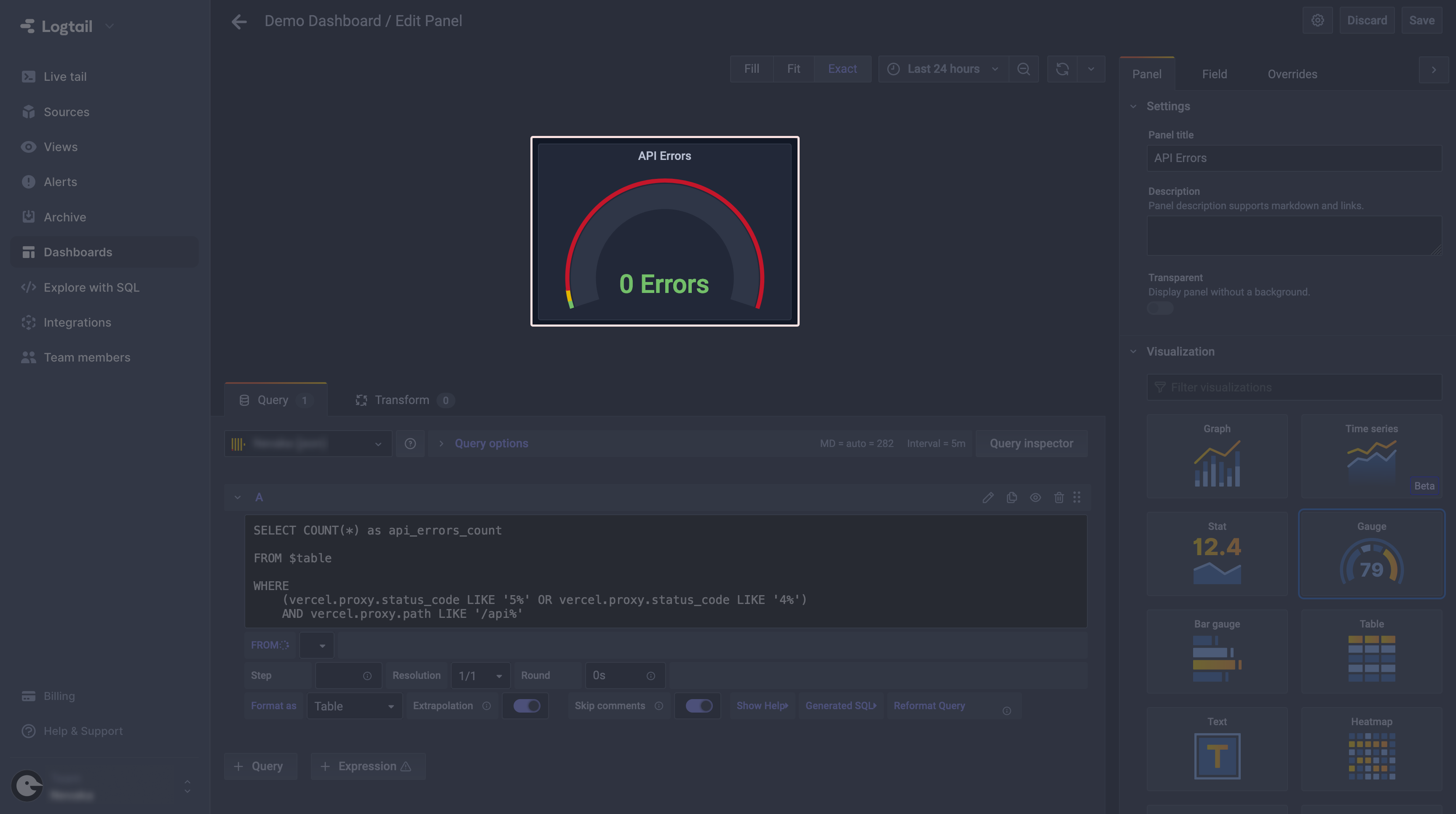
Another useful panel we might want to have on our dashboard is an API errors counter. Since you already know how to add panels, I’ll jump straight to the query:
Since we want the panel to look like the one before, select the Gauge visualization style again. Now you can play a bit with the Gauge configuration to achieve a similar effect to what I’ve configured.
Again, remember to save your work and we can proceed to creating the next panel.
(3) Mean API route execution time
The next panel will have a bit more complex query, as we’ll use some of the ClickHouse utilities seen before. So, create a new panel like you did before and let’s begin.
The first thing we have to do is to figure out from where we can extract the information about the execution time of out routes. To do that, open the Live tail in the second tab and take a look at one of the logs that appear there:

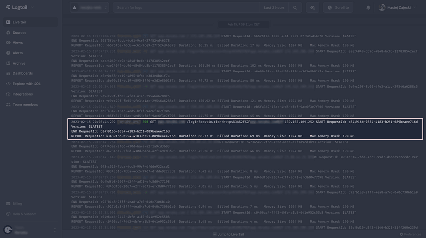
See that long message? We have two values describing how long it took to execute a particular route handler: Duration and Billed Duration. We’ll focus on the second one, since it’s just a rounded up value of the first one and an integer, which will be easier to parse.
Wait, you said parse? Yes, because all that data is (unfortunately) contained in one big string which can be accessed in the query under message. So we have to figure out a way to extract the data we need, and that’s where some utilities come in handy.
Let’s start with a simple query to retrieve the whole message for each request:
This will present us with whole messages in the table. It’s a good starting point for the final output we want to have, which is a numerical value extracted and parsed from the message string.
Thanks to the docs provided by ClickHouse, we can use a regular expression to extract the substring we need. By the way, now is the right time to use multiple queries at once to have previous stages always available. In order to do so, click the Duplicate query icon to have the new query appear below. You can now select which query output you want to see under the table.
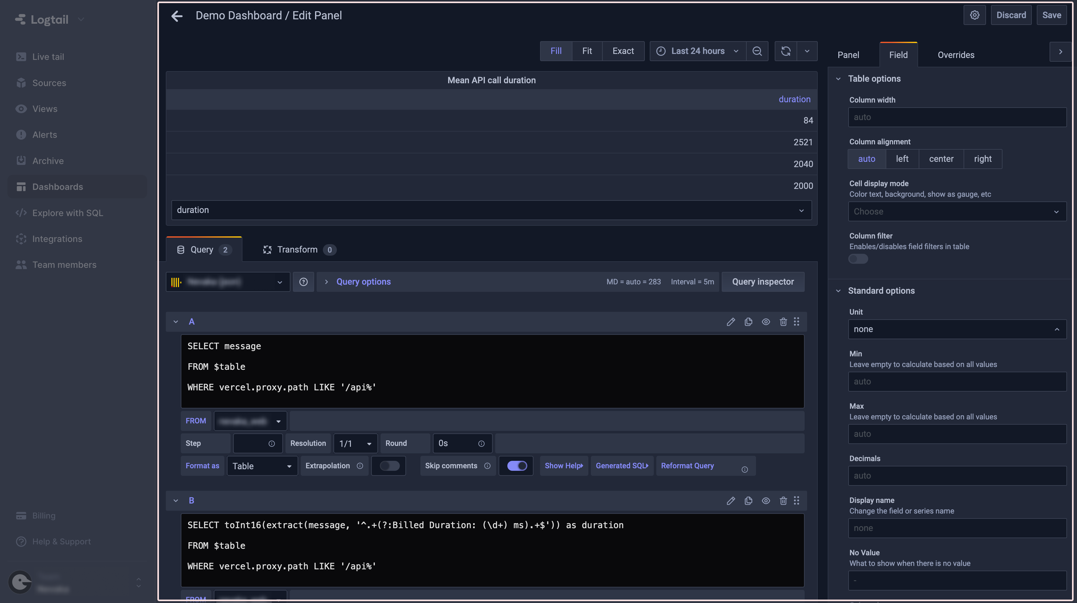
As you can see, using extract and toInt16 ClickHouse utilities, we were able to extract the duration time from the message string with a regular expression. Another way to do it would be to find where in the string the duration fragment starts and ends, and retrieve the value by extracting a substring of a certain length. But since we can use regular expressions, it is simpler and safer to do it that way. You can now delete the initial query.
Now, we just have to decide how to display that data and we are done with this panel. Select Stat in the Visualization section – that will change the display mode to both a numerical value and a simple graph underneath looking like this:
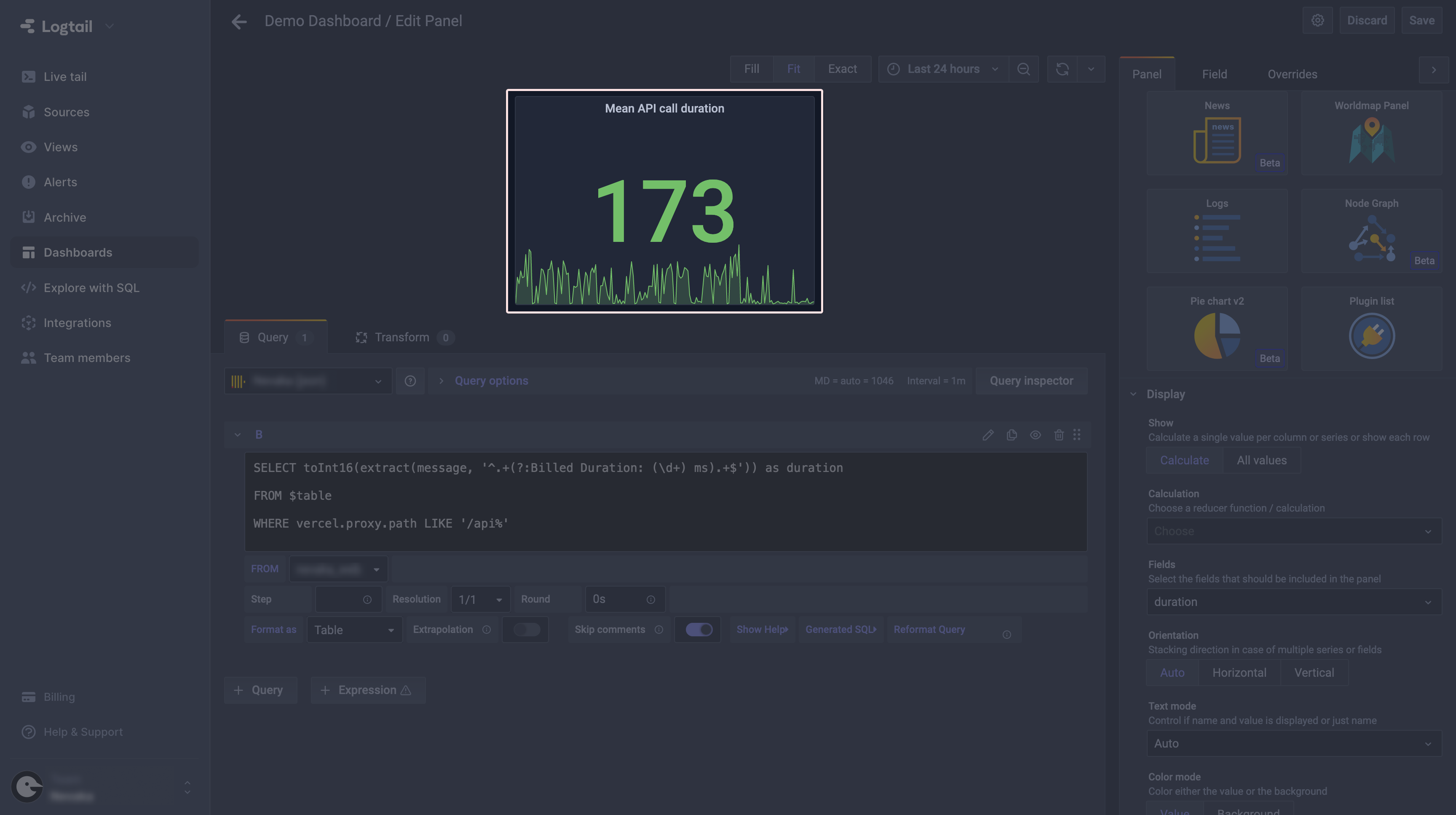
You may say, “Wow, an average of 93 milliseconds for API calls? That’s really good!” Well, bad news here. This is because the panel is not yet configured to show a mean of the queried values. In order to do so, select Mean in the Calculation field. You can also change the unit to milliseconds in the Field tab, as well as set up the desired threshold for alerting (red) color.
With that, remember to save changes and we are done with that panel! Your dashboard should look something like this now:
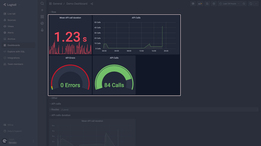
One more thing – you can group panels using rows. That is useful if you have multiple panels and they present data from different parts of the app. In order to add a row to the dashboard, select Add panel (the same button you’ve used before), but this time click on the Add a new row option. You can now drag your panels into that row and have your dashboard look a bit tidier.
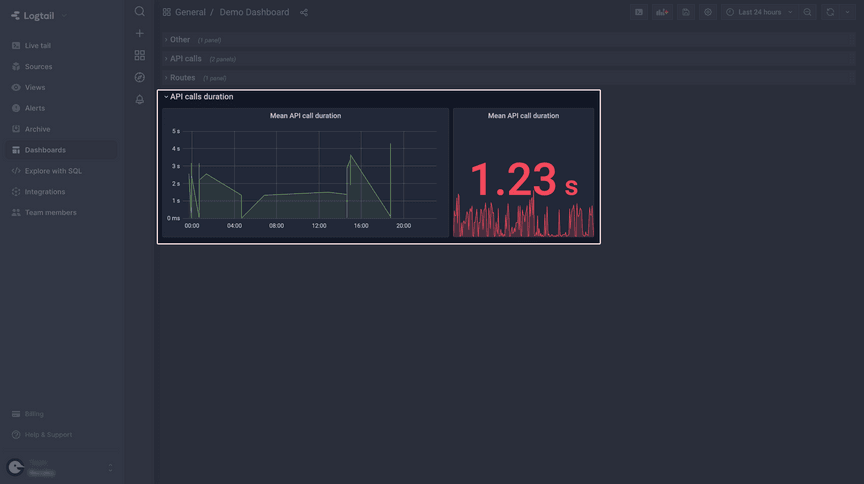
The Stat visualization style is great for things such as detecting fluctuations, but you may also want to have a more detailed chart, so let’s add that. Use the Duplicate option once again and open the panel editor.
Select a Graph visualization, change the formatting to Time series, and modify the query – it looks similar to what we’ve used to create the API calls panel.
Save your changes and that wraps up the API calls duration part.
(4) Top 5 most frequently accessed app routes
We’ll add yet another panel to our dashboard, which will display the 5 most frequently accessed routes in our app. This information could be useful to get insights on what features the users prefer. By routes I mean here only the “real” routes that are accessible by the user, so we won’t be taking for example /api into consideration.
To do that, let’s add a new panel and create a simple query which will give us a list of routes and their visit count, like so:
That will result in an output looking something like this:
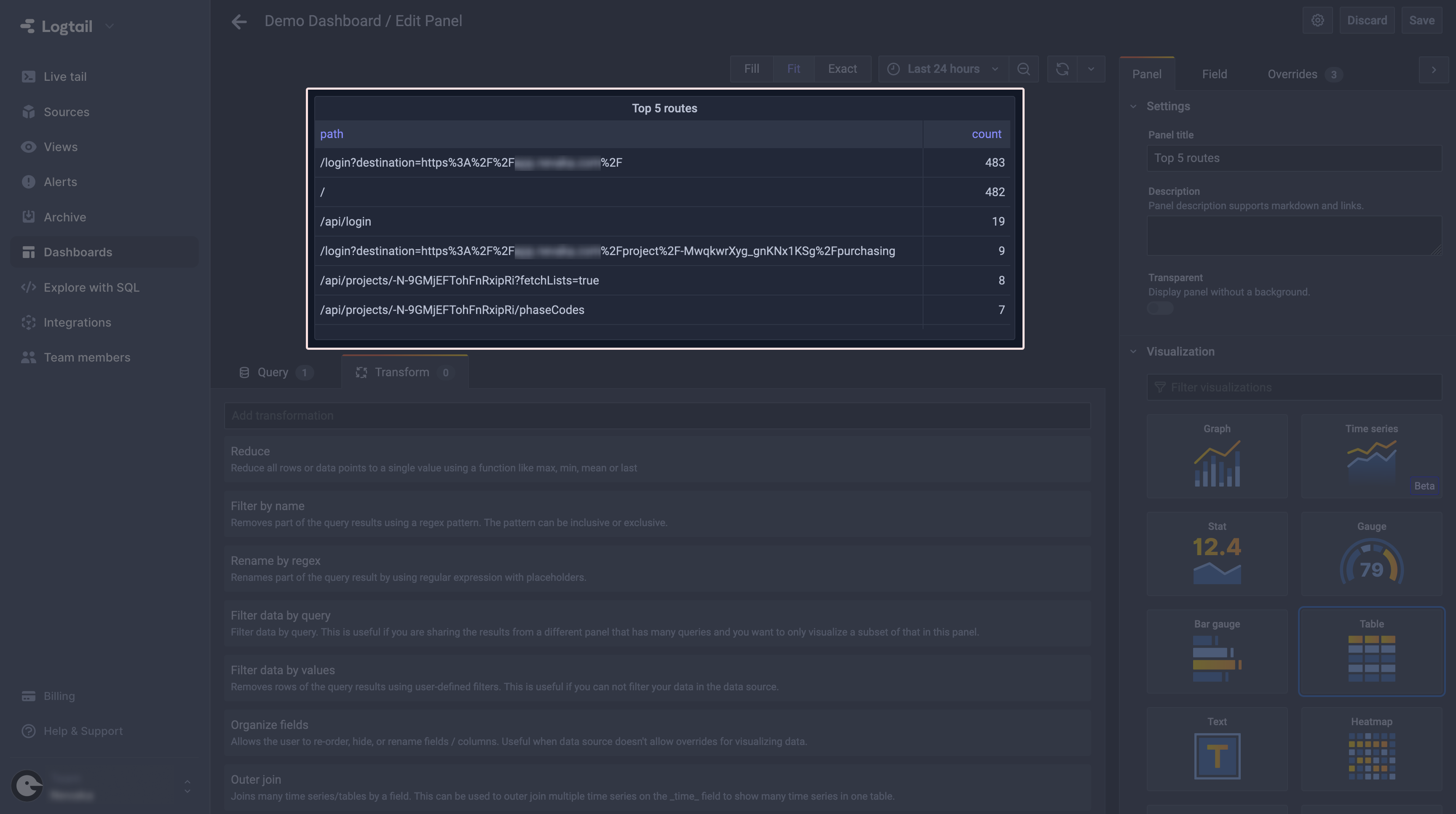
As you can see, we have not only the API routes included in the results, but some files too. There is also another problem here – the query parameters, as well as some IDs that are a part of a URL, result in a single route not being grouped properly.
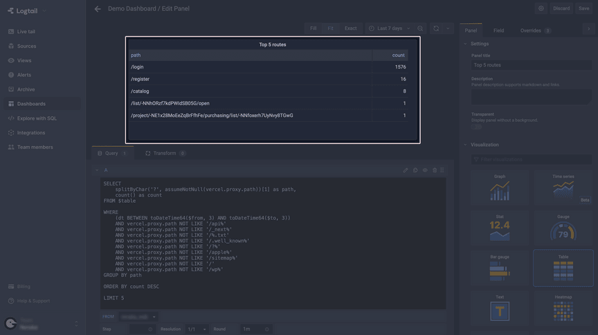
The first issue can be addressed by simply adding an extra filtering to the WHERE clause. Just add the routes you want to avoid using the NOT LIKE SQL clause, and that’s it.
Regarding the query parameters and IDs – in order to avoid that problem, we’ll (again) use some ClickHouse magic. Let’s start by removing the query params first. In order to do that, we have to split our path string at the ? character and take just the first part of it. For that we need two utilities: splitByChar and assumeNotNull. The first one will split our path string at the designated character. The second one is needed to make splitByChar accept vercel.proxy.path string, as it is nullable (but in our case it won’t be, so we can use that utility). The query should now look something like that:
This should yield the following result:
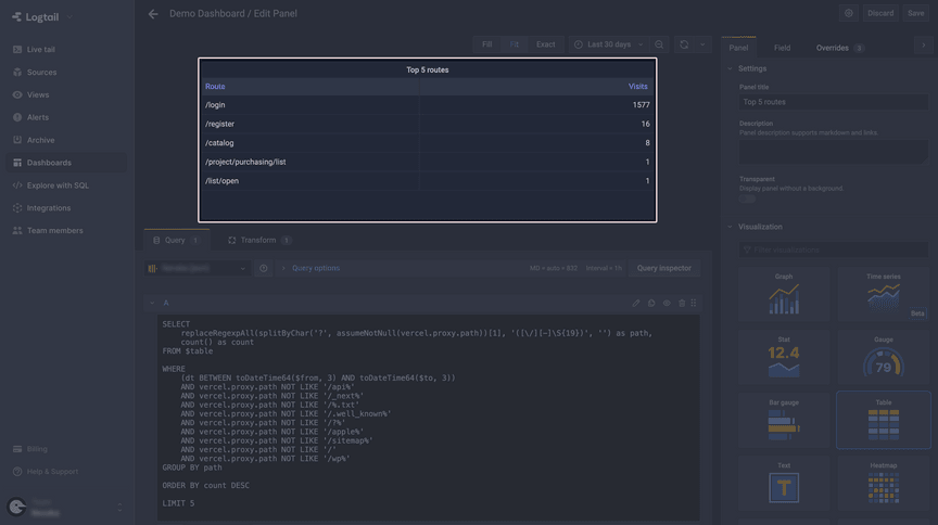
As you can see, now we only need to take care of the IDs. Since we want to have routes like /project/[id] grouped together, we have to simply remove the ID part of the string. Again, ClickHouse comes in handy with the replaceRegexpAll utility. It will allow us to use a regular expression to replace the unwanted part of the string with an empty one. One thing you’ll probably need to figure out on your own is the correct regex for your use case. I came up with the following, and the query now looks like that:
Now the results are much cleaner, and – more importantly – grouped properly:
The last thing we’ll do is to change the names of the columns, so they better represent what’s in the table. Of course, you could change them directly in the query, but there is a better way. Switch to the Transform tab (it’s just above the query editor) and select Organize fields. Now you can enter any name you want for every column.
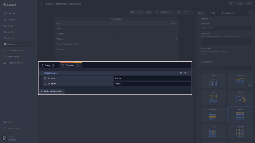
And we are done! Last but not least, a quick reminder for you to save your work and we can proceed with wrapping things up.
Wrapping things up
I hope that you’ve completed all the steps and your dashboard looks similar to mine.
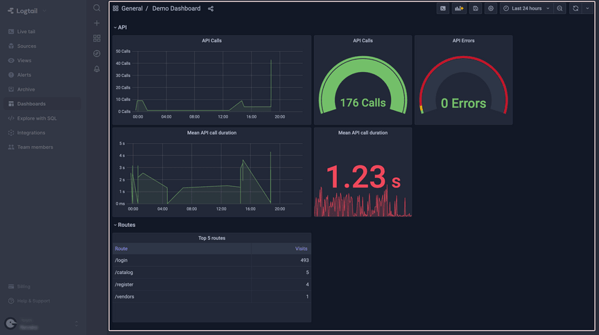
The panels we’ve created were meant to show you the basics of creating a Grafana dashboard for your app. Of course, there are a lot of other options that we haven’t talked about, but I hope that you can see how this tool can help you with data analysis and gaining insights on how your app performs, which will encourage you to explore it on your own.
To help you get started, here is a list of various sources that I’ve used that might be helpful:
Have a project in mind?
Let’s meet - book a free consultation and we’ll get back to you within 24 hrs.
Maciej is a full-stack developer with a passion for creating seamless, beautiful, and performant Web and mobile applications. Not afraid of new challenges and technologies, he can support development at any stage. Outside of coding, Maciej enjoys spending time with his two lovely cats. As an avid tennis player, he hits the courts regularly to stay fit and unwind.


