


Go mobile or go home – RWD & mobile first rule
Increased mobile usage and spending more screen time on the phone – that’s the sign of today’s world. People do everything on their smartphones – browse through the websites, check social media, pay bills, chat, listen to music. All these actions lead to one conclusion – there’s a need for a great mobile experience.
Do you know the share of web traffic by mobile devices? According to Statcounter, it’s over 55%. Quite a lot, right? And the numbers are yet to grow. This broad usage of the internet means that whenever a digital product is created, it should be adjusted to mobile devices. It’s inevitable.
Is your website responsive? Is it ready for different devices and screen sizes? Does your business need mobile application development, or is responsive web design sufficient? By the end of this blog post, you’ll get the answers to all of those questions.
In this article, I’ll cover:
- the importance of responsive web design (RWD),
- benefits of RWD,
- how does responsive web design affect the accessibility of content,
- responsive design vs “mobile first” web design principle,
- responsive web design vs mobile application,
- good practices in RWD & “mobile first” web design.
Why is responsive web design important
Responsive web design (RWD) is used to adapt a website’s layout to a user’s device. Whether it’s a laptop, mobile phone or tablet – it doesn’t matter. It’s still web design responsive. The screen sizes and resolutions don’t play a role here since the purpose of responsive design is a seamless experience on each of them.
It all started with Ethan Marcotte and his article in which he introduced the idea of responsive web design. He wrote about the design principles that cover fluid grids, media queries, and flexible images. Now, it’s a foundation for everyone who’s working on the web.
The “mobile first” web design approach
Responsive web design is related to the “mobile first” principle as it’s about starting the product design from the mobile version and gradually scaling it up to larger screens. In other words, you start from a limited form and expand its features to a full version of a product. In that way, you create a strong foundation with a responsive design, which works well on every level.
Earlier, in the previous days, it was the other way around – first, it was the desktop version, while the mobile one was left for later stages. Well, not anymore.
What’s the idea behind the “mobile first” rule? As I said before, it’s related to responsive web design through the focus on mobile devices. So it’s exactly what we’ve been talking about in this article, and that’s why it’s so important.
Because smartphones are becoming such a crucial part of our lives, businesses and organizations should make their websites responsive, that’s mobile-friendly. Thanks to this, they can increase their conversion rate, making the “mobile first” rule more important than ever in the product design. But we’ll get back to this strategy later.
Have a project in mind?
Let’s meet - book a free consultation and we’ll get back to you within 24 hrs.
The benefits of responsive web
For now, let’s focus on the benefits of the first concept – responsive web design. How your website benefits from it? Why should you care about the responsive web?
- great user experience – owing to usability tests and focusing on content, RWD helps you provide a seamless experience across devices and platforms.
- SEO friendliness – as websites with responsive web design have one URL that serves all devices, it’s easier for them to rank better on Google since they promote mobile-friendliness.
- flexibility on all devices – the users don’t have to install anything to get to the content. All of it is accessed through a browser.
Have a project in mind?
Let’s meet - book a free consultation and we’ll get back to you within 24 hrs.
Good practices for RWD
- focus on UX – how to ensure that responsive web design will be done well? Take care of user experience (UX). And that also entails close collaboration between designers and developers. Since RWD is about shuffling elements around the website, the team’s primary task is to ensure that the content doesn’t disrupt the overall UX. This step involves usability tests with the target audience across platforms.
- prioritize the content – think about it – are you capable of scrolling down in search of the thing you’re looking for? Because I surely am not. I want to see it immediately. By content prioritization, you’re shortening the process of looking for the correct answer to a bare minimum. Thanks to this, the users will be more prone to using your website again.
- improve the website performance – this can be an issue here, and that’s precisely the reason why you should focus on it. You don’t always have a great internet connection while using your mobile phone – there may be a weak signal, and what then? If you are thinking about doing responsive web design to your website, test it wherever you can. After all, the ultimate goal of a responsive web is to provide equal access to data on all devices.
Good practices for the “mobile first” approach
- concentrate on simplicity – don’t overdo it – start slowly, with the most core features in mind and a simple responsive design.
- focus on content – just like in the case of responsive web principle, a content-centred sense is something you strive for in product design.
- listen to the users – there’s no way that you make a successful product without users. Their needs, problems, and feedback are what you should pay attention to when prioritizing the features.
Should you build a mobile app or a mobile website?
If you’re trying to choose which mobile strategy works best for your business, there are some issues to consider. These include costs, implementation time, performance, UX, design approach and long-term app maintenance. Let’s see the comparison of mobile app development and a website with responsive web design.

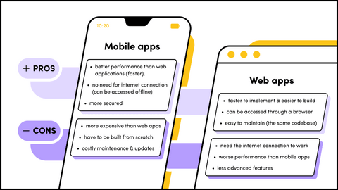
As you can see, there are many pros and cons of each solution. However, depending on your business’ needs and requirements, you should choose the mobile strategy that’s right for you.
Key takeaways
Summing up, neglecting to adapt your website to a mobile version won’t pay off at all in today’s world. As mobile usage is increasing, entrepreneurs should provide their users with a good experience on their websites. Hence, you should consider mobile first web design and responsive web design in product design. There’s no way around it. Either you have web design responsive, or you don’t exist at all.
And how’s your mobile experience? Let’s talk about it!
Have a project in mind?
Let’s meet - book a free consultation and we’ll get back to you within 24 hrs.
Ela writes about the fundamentals of great development, project management approaches, ways to develop a proof of concept or an MVP, UX, our company culture, and many other things happening in Gorrion.
Other worthy reads


